

Back to Home
Overwatch 2 Case Study
Duration
August 2024 - October 2024 (8 weeks)
Role
UX/UI Designer
Project type
Skills
User research
User Experience Design
UI Design
Prototyping & Iteration
About the Project
Overwatch 2, developed by Blizzard Entertainment, is a 5v5 team-based first-person shooter game that offers players casual and competitive gameplay, a wide variety of playable heroes, and various game modes. In this project, I studied how well the current game meets game developer intentions and player expectations, leading me to redesign the play screen, gameplay screen, and post-game summary screen in Overwatch 2 to improve the overall player experience while keeping the original UI intact.


Challenges
Improving the user interface to better the communication between players and game developers.
Simplifying the game mode browsing experience to make it more seamless for players.
Providing the necessary information through in-game UI to assist with player gameplay.
Increasing players’ ability to assess their gameplay through an improved post-game summary screen.
Planning and conducting usability tests to understand the user experience that players expect.
Creating wireframes that replicate the UI style guide of Overwatch 2 with increased accessibility.
Work Process

1
PLAYER JOURNEY
2
PAPER PROTOYPE

3
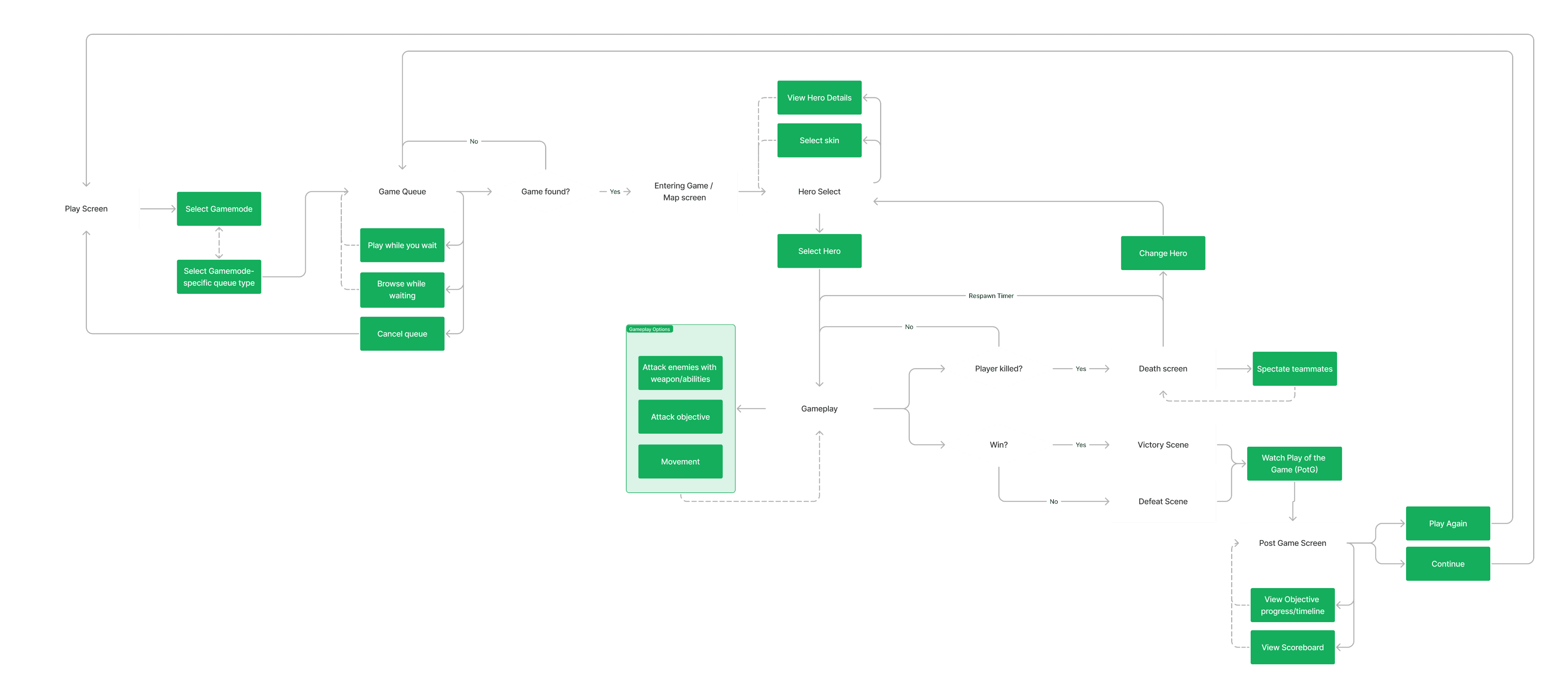
FLOWCHART

4
WIREFRAMES

5
USABILITY
TESTS

6
UI
MOODBOARD

7
UI STYLE
GUIDE
8
UI
MOCKUPS
9
ACCESSIBILITY
TEST
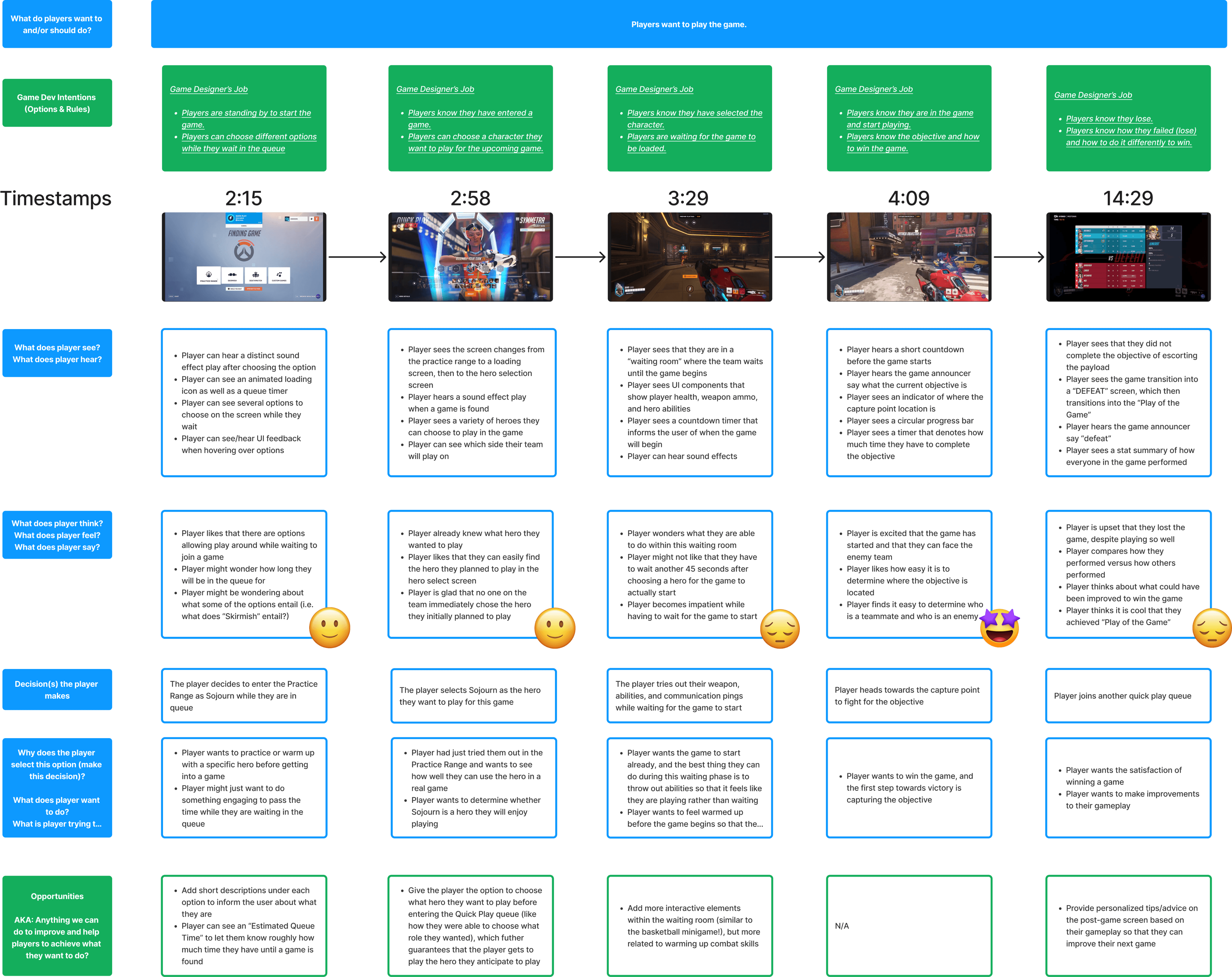
Player Journey
Putting myself into the shoes of the player is the first step that I took to get started with improving the player experience in Overwatch 2. I analyzed sample gameplay footage of Overwatch 2 and took note of the options on each screen, what players are experiencing, what decisions are being made and why, and any opportunities for me to improve the user experience so that players can achieve what they want to do.
Paper Prototype & Flowchart
After getting a better idea of game dev intentions and what players want to do in the game, I created a paper prototype and flowchart to organize each major screen, game dev intentions, and options that should be available. Some options and intentions listed are already in the game, while some are new additions made by me based on the opportunities I found in the player journey diagram.

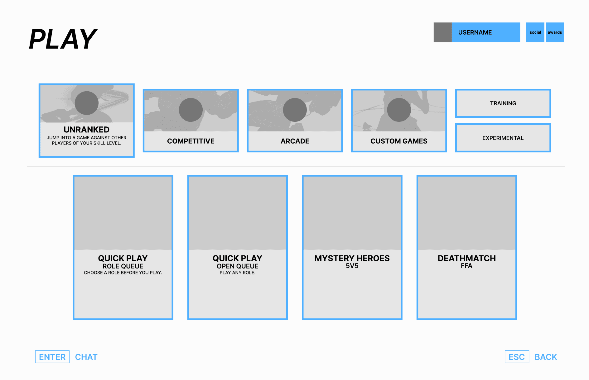
Low Fidelity Wireframes
Play Screen
The play screen includes all the different game modes available to the player. Upon choosing a game mode, additional queue options appear as a dropdown instead of a separate screen (as implemented in the current game) while still showing a minimized version of the same game modes. This design is meant to create a more seamless back-and-forth browsing experience that showcases all options on a single screen.

Gameplay Screen
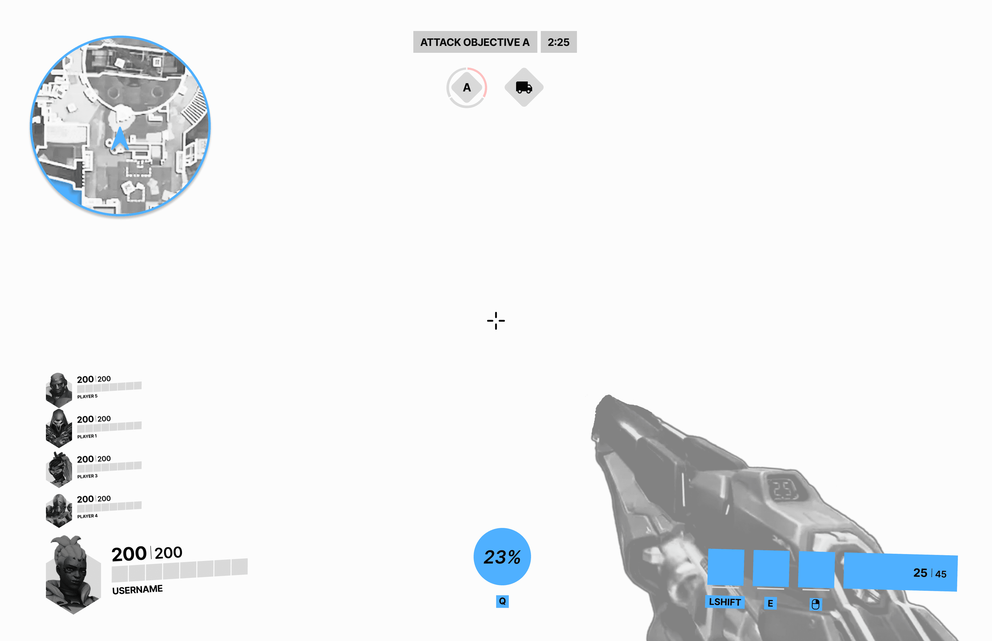
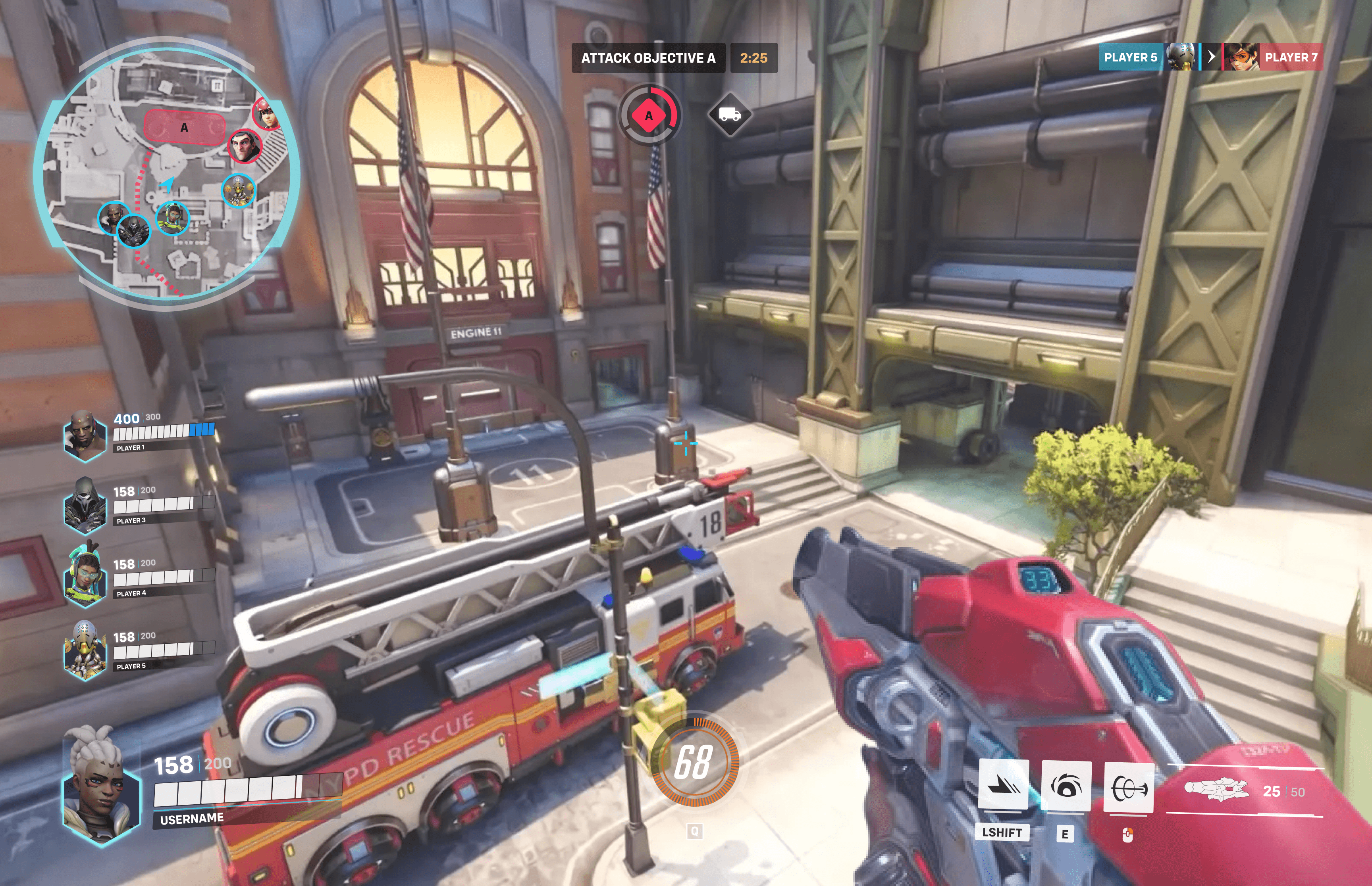
The gameplay screen includes all the basic UI to provide the player with necessary information regarding the state of their gameplay, such as player health, abilities, and objective progress.

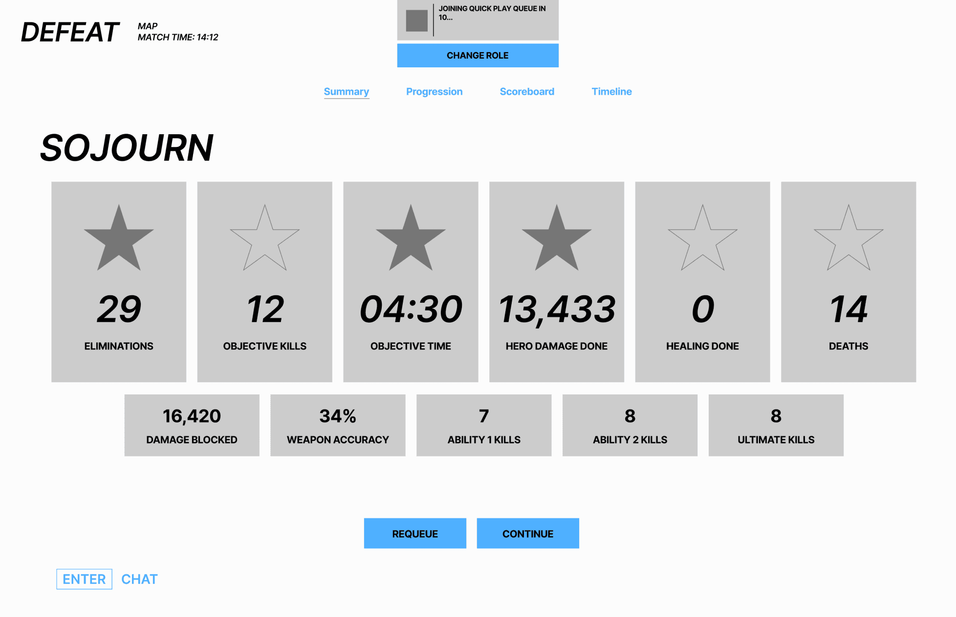
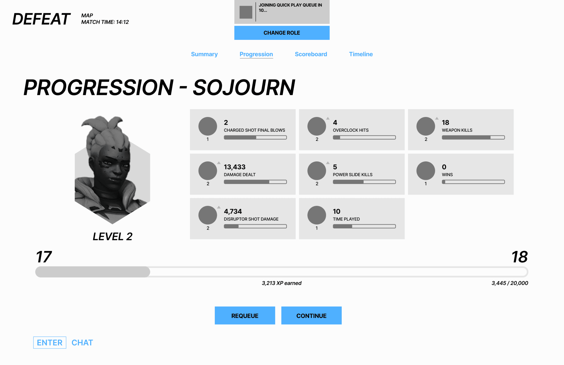
Post-Game Summary Screen
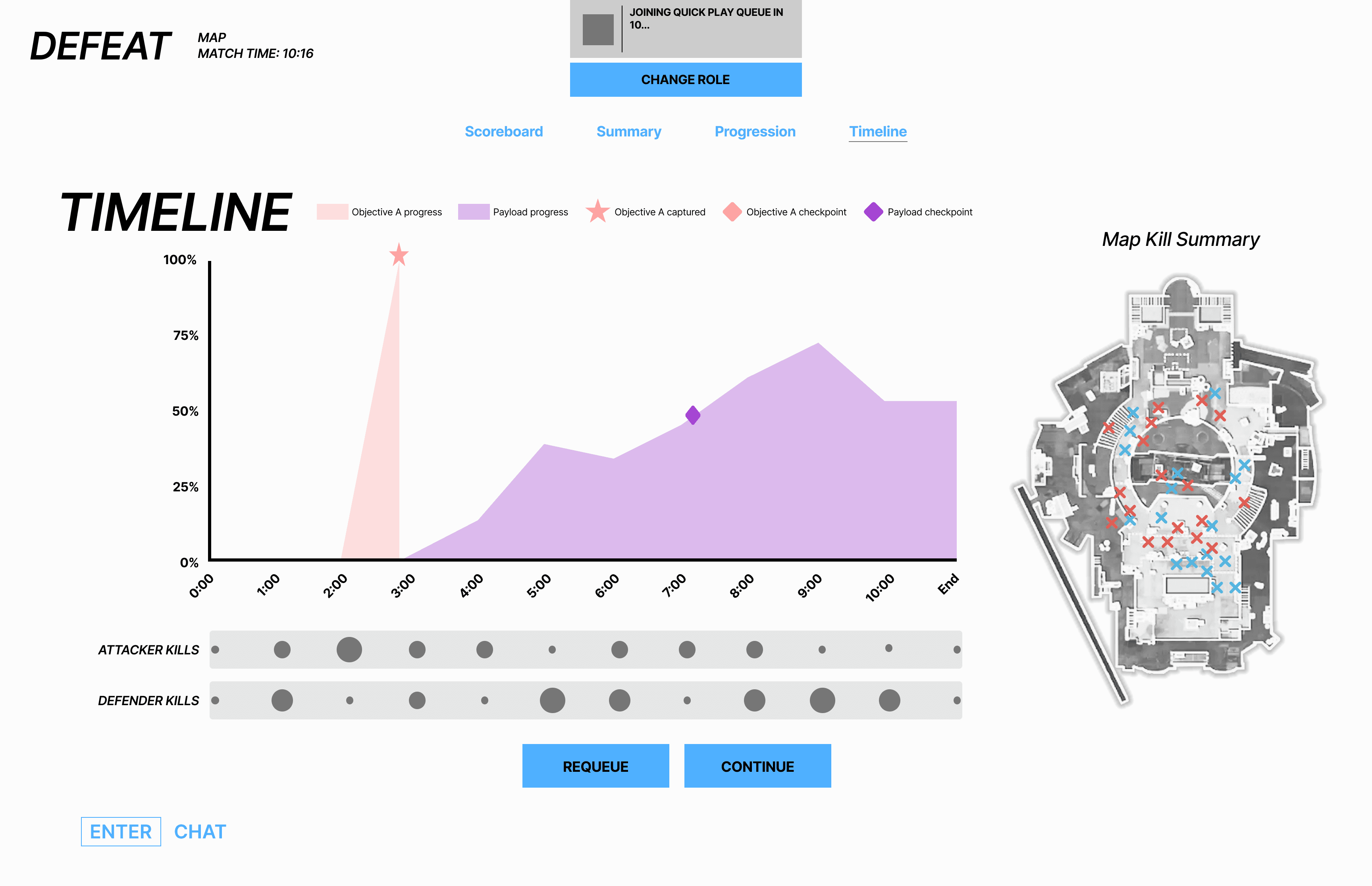
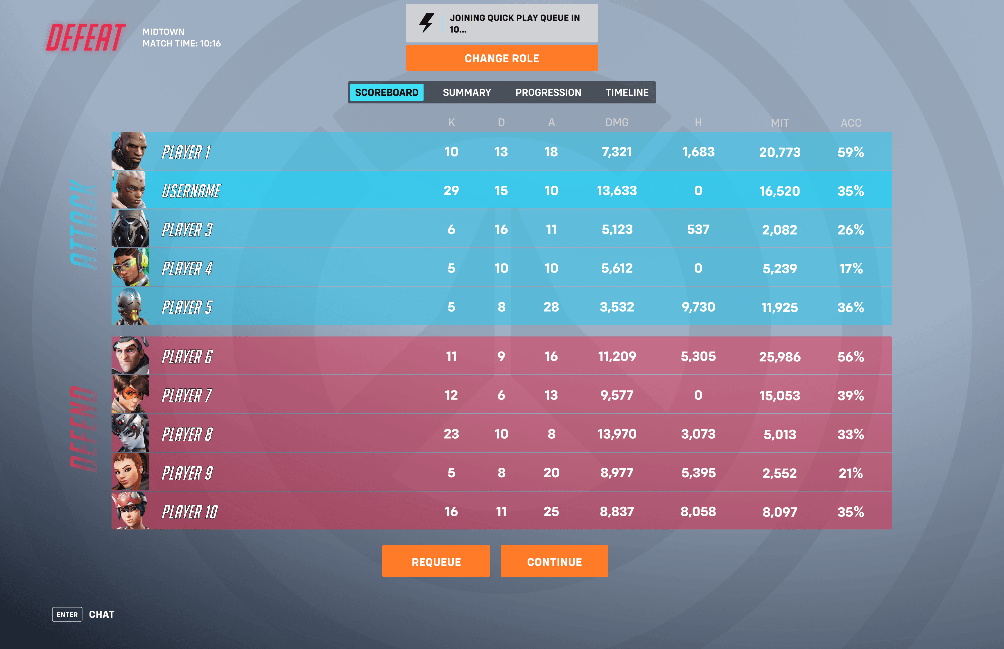
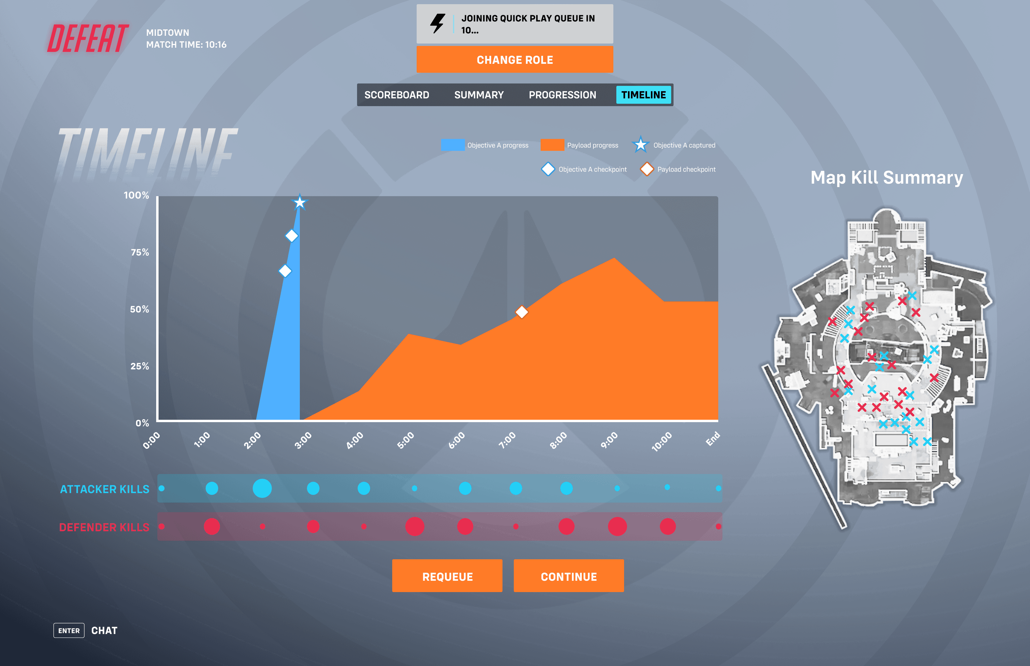
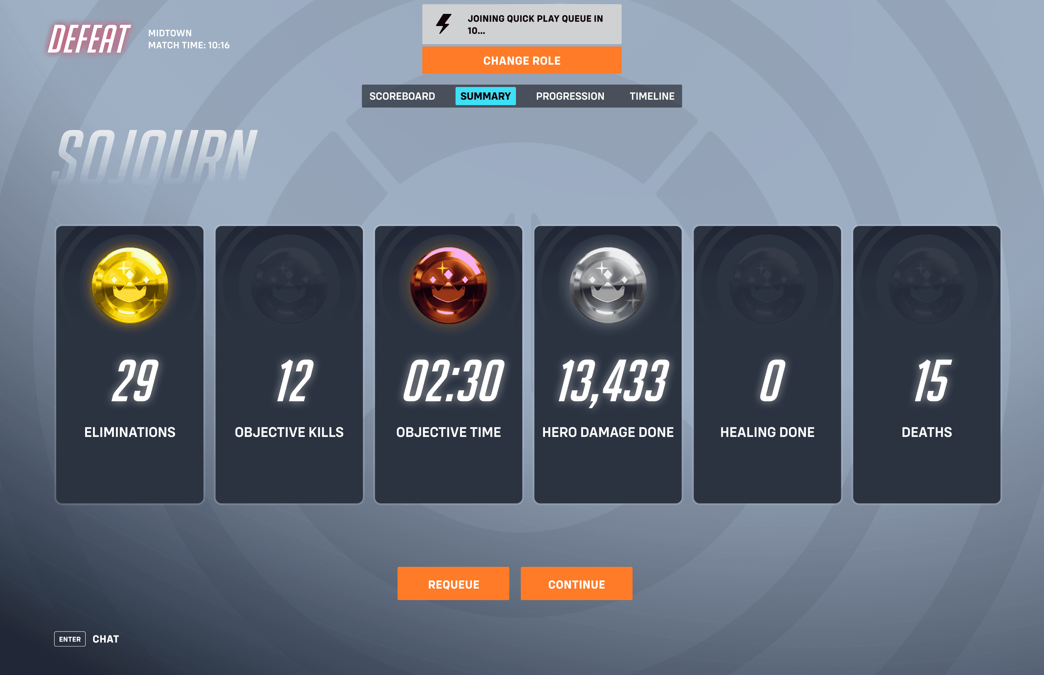
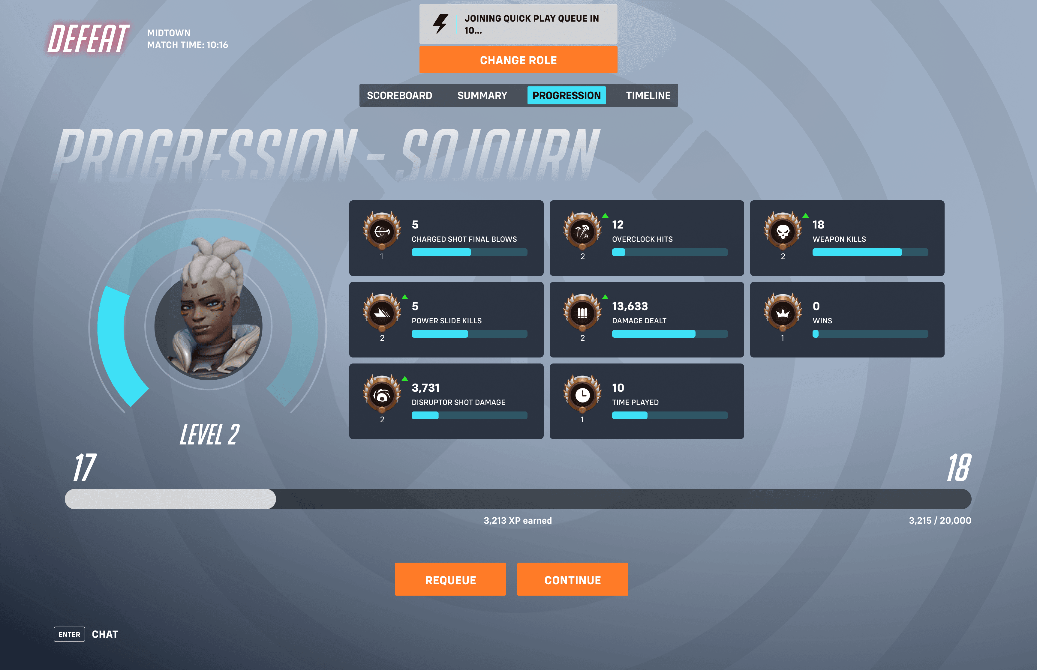
The post-game summary screen includes several tabs with useful information stats about how the player performed, how others performed, and how the overall match played out. These screens should improve the player’s ability to quickly assess their gameplay and what changes need to be made in order to achieve success in their future games.


Usability Test Results & Iterations
GENERAL NOTES
Both participants completed each task with ease, both taking similar approaches to complete them. This shows that these designs conform to what the usual FPS player would expect to see in the game.
Both participants instinctively started clicking on certain options of the prototypes, showing that the options were clear to find and they instantly understood that they can be clicked on.
PLAY SCREEN
The dropdown design in the play screen garnered positive feedback, participants say that it makes browsing easier and takes less steps than the original design.
Nothing needs to be changed
GAMEPLAY SCREEN
Mainly positive feedback, the UI contains all the basic information that the player needs to understand the state of their gameplay.
Add minimap
Participant 1 says he sometimes gets lost in random corridors, provides good information.
Add teammate healthbars
Nice to know the health of teammates, more useful information.

POST-GAME SCREEN
Make scoreboard the first screen
Both participants both found the scoreboard their favorite and most useful.
Remove less important stats
Participant 2 found some of the stats not useful to the player, and it just adds unnecessary clutter.
Add images of heroes
Both participants, when analyzing the scoreboard, were trying to determine which players played which roles, and knowing the hero/role is good context for their stats.
Add map to timeline
Both have said it is nice to know the positions of people and objectives at specific points in the game.
Give meaningful colors to the performance stars on the summary screen
None of the participants made comments about the stars nor did they grab their attention.
High Fidelity UI Mockups
UI Moodboard

1st Iteration UI Mockups
Play Screen

Gameplay Screen
Post-Game Summary Screen


Colorblindness Simulation
I ran each of my mockups through a colorblindness simulation to assess accessibility for those who deal with different types of colorblindness. The full test can be seen here, but the following notes include my key findings:
Gameplay Screen

Players with protanopia (red-blind) have trouble depicting the red indicators (enemy labels, objective progress bar, etc.) since they blend in with gray colors that surround it, which can negatively impact their gameplay.
My solution was to change the objective color indicator to blue (same as ally color) and the enemy color indicator to purple. These changes are much more accessible since these new indicator colors are much more clear to those with protanopia, and seem to not affect those with other colorblindness variations either. The purple also replaced the red that appear in my other wireframes.

Post-Game Summary Screen
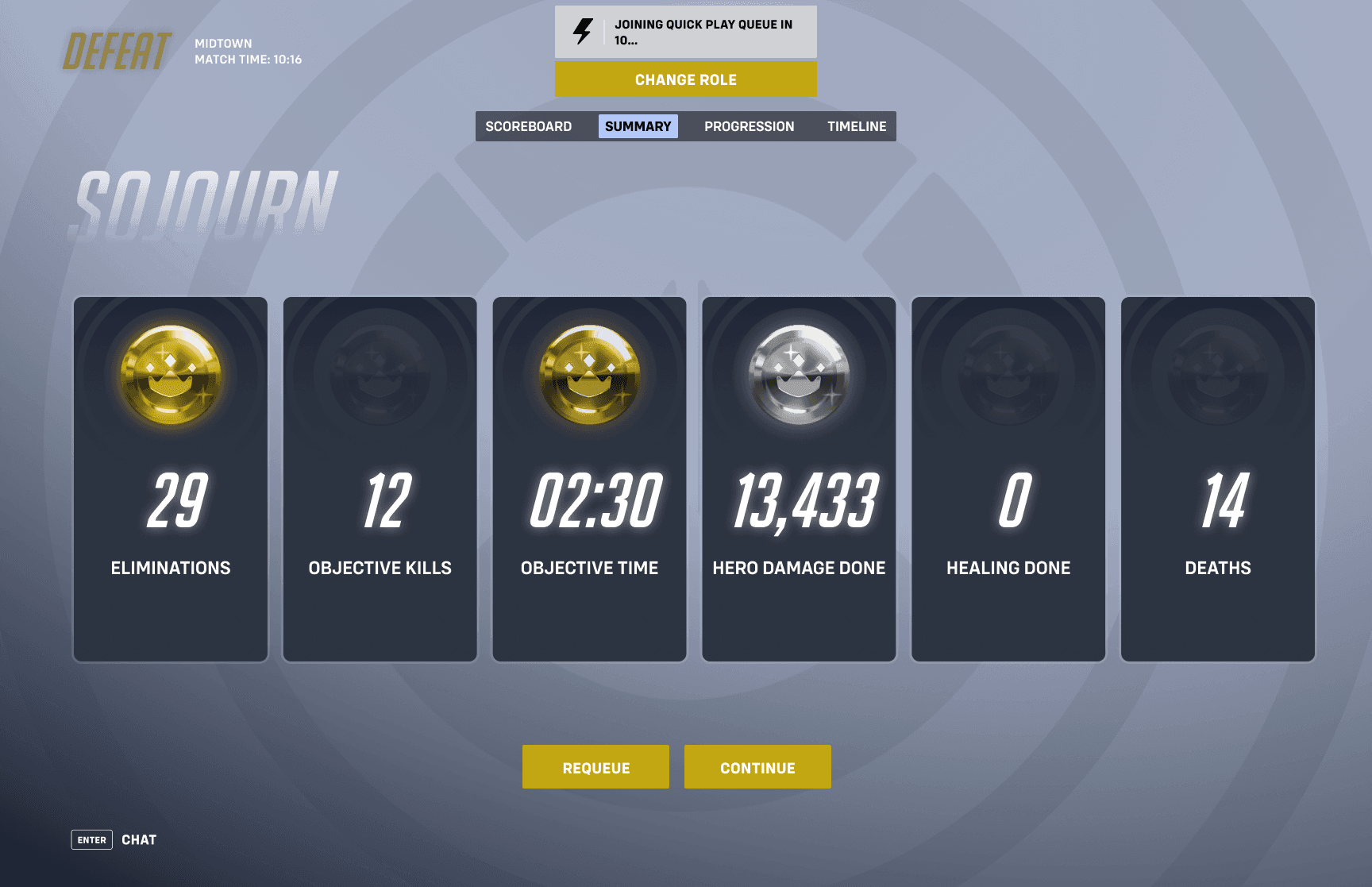
The gold and bronze performance medals in the post-game summary screen are almost indistinguishable for players with deuteranopia (green-blind), meaning that this information is unclear/ambiguous.
My solution was to add more contrast between the two medals so that they appear more distinct to those with colorblindness.
Final Design


Style Guide

Outcomes
Leveraged and further developed my current UX/UI design skills while being applied to a gaming context.
Learned the role that UX/UI designers play during the development of a video game, creating the bridge between game developers and players.
Practiced creating/replicating the UI style of an existing on Figma.
Understood the importance of accessibility tests when creating wireframes for a game.
Reflection
This is my first project where I worked on the user experience and the user interface of an existing video game, and I am pretty happy with the way things turned out! This is also the first time that I was able to test out Figma’s capabilities of creating UI elements that follow an existing style guide. I was able to showcase my attention to detail and Figma skills through the final mockups since I was replicating the style guide of Overwatch 2, and I was also to show off my UX skills through the player journey and usability tests to create an improved player experience. Moving forward, I would like continue practicing creating UI elements that follow a variety of styles, and also test out my ability to create my own unique style guide for a future gaming project!